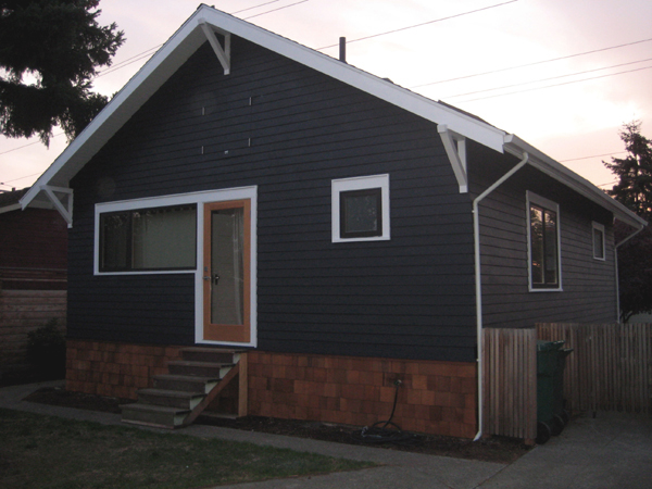
One of the things that attracted us to our house was its inherent simplicity. Despite its cosmetic lacking, the overall form had not been botched too much over the years. Living in Seattle we’ve also come to realize the importance of an entry space, somewhere to unload muddy shoes and rain gear as well as serving as a buffer between heated and unheated areas. Just as important, we envy the homes that have open front porches, a place to hang out on warm summer nights and talk with neighbors. Throughout its life, our house has had each of these elements. Our design problem was that we wanted both.
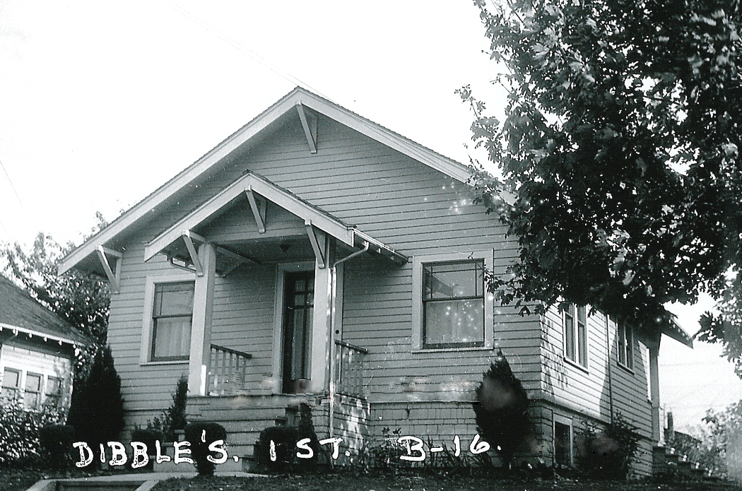
A reminder of what chezerbey looked like in its adolescence (taken sometime in the ’30s). Simple, open porch and smaller windows. You can just barely tell, but on the right side of the photo you can see the corner of the open back porch.
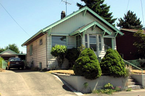
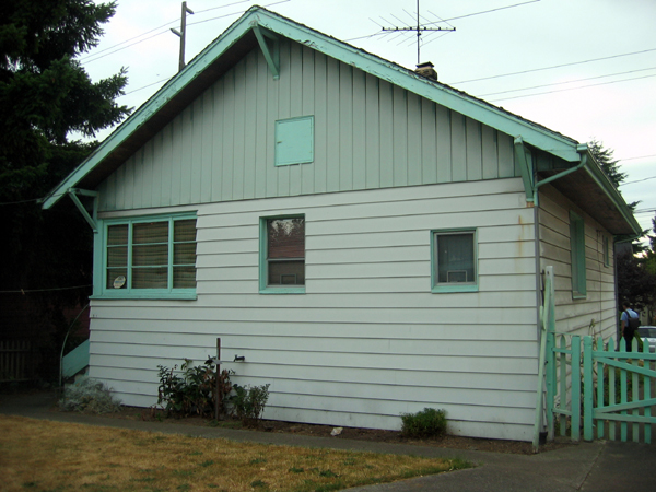
70 years later. Larger, double pane aluminum windows replaced the original wood double hungs. The porch was closed in and everything was covered with aluminum siding. Apparently there was also a sale on teal paint. The gable end (also metal siding) was originally a darker teal color but faded over the years.
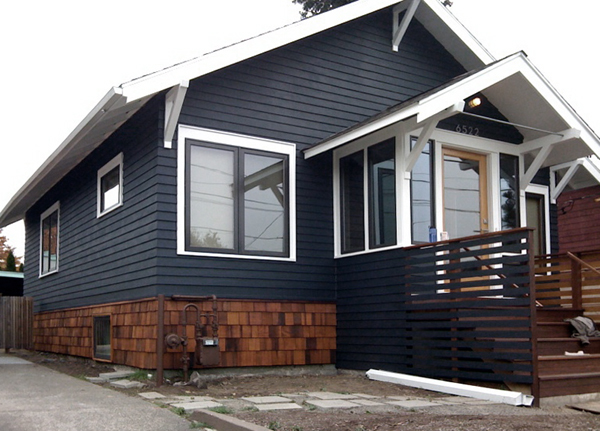
Three years later! (To be exact, all the exterior work was done in the last 8 months with the exception of the main roof which we replaced 2 years ago.)
In terms of design, we used SketchUp (bottom left image) quite a bit to try out different design ideas. One of the things that we didn’t love about our house was the symmetry. We considered a few different designs that would introduce some asymmetry – such as expanding the porch to the south, replacing one of the large front windows with a bump-out, or reconfiguring the steps. Ultimately though, big changes meant big $$ and we were definitely on a budget. The final design was a happy compromise – by changing the rise and run of the front steps we were able to add a 3′ deep landing at the top of the stairs. In addition to the “stoop seating” we could fit a couple of small chairs in that space and achieve our desire for a porch. We also maintained a deep overhang at the porch roof for extra protection from the elements.
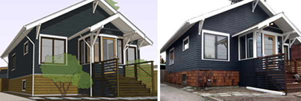
While the completed interior portions of the house are fairly modern, we were more limited on the exterior. Though simple, the form and certain details are somewhat traditional. So, we decided to be selective and subtle in our modernity.
- First and foremost, the color is different. There is a fine line, we quickly learned, between blue-gray, navy blue, and country blue.
- For our new windows, we chose a dark brown metal clad window which adds an extra pop against the white trim.
- We wanted to avoid the “tacked on” look that a lot of entry steps have so we designed the beveled cedar siding at the side walls of the porch to extend out, effectively becoming the guard rails for the stairs. To play on the idea of integration and transition, we notched the siding at the stair portion to become the more open and inviting slats.
- We knew we needed to replace the existing shingles at the base of the house, but we wrestled with what we would replace them with. We considered continuing the beveled siding down, but that option was expensive and we felt like visually, the house need a base. We also considered using hardi panel or corten steel panels, but these options seemed to contrast to much with the character of the house. Ultimately, we went back to the shingles, but opted for a dark brown stain that would pick up on the fir and ipe.
- The two knee braces support the porch roof overhang, but structurally speaking, without something tying them together and completing the triangle, the roof would have a tendency to splay out. So we bolted a piece of all-thread to each of the braces and slipped a piece of conduit over. We probably get more comments on that one element than anything else, but it’s playful and we like it.
- In terms of other small touches, we chose modern house numbers (Neutra from DWR), an industrial jelly jar style light that we picked up at Home Depot(!!), modern door hardware from Emtek and a clean and simple mail slot and doorbell.
So that’s it! Besides a complete landscaping overall, we also have plans to (eventually) add a deck off the back of the house. To see the full process, check out the exterior page.
Hi, would you mind sharing the exterior paint color, it is beautiful. Thanks
Hi Ashley, it’s “soot” from Benjamin Moore.