Remember those sketchup images that we posted last week? The ones we were all excited about? Well, they are officially old news…put them in your virtual recycling bin because Kyle has busted out some mad sketchup skills on this revised design.
This week we started thinking more about lighting, which led to thinking more about the ceiling, which led to vaulting the ceiling. It’s an idea we’ve tossed around for a while. Originally, our plan was to vault the living room space and do a loft over the back half of the house. Concerns about loft head height and acoustical separation from the bedroom below eventually nixed that idea. But because we will be creating a long and narrow kitchen/dining/living space, we also wanted to avoid the “bowling alley” effect. Here’s what we’re thinking:
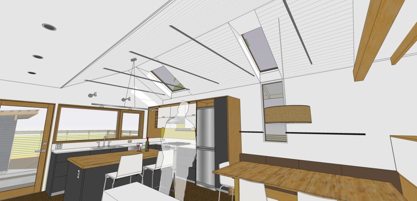
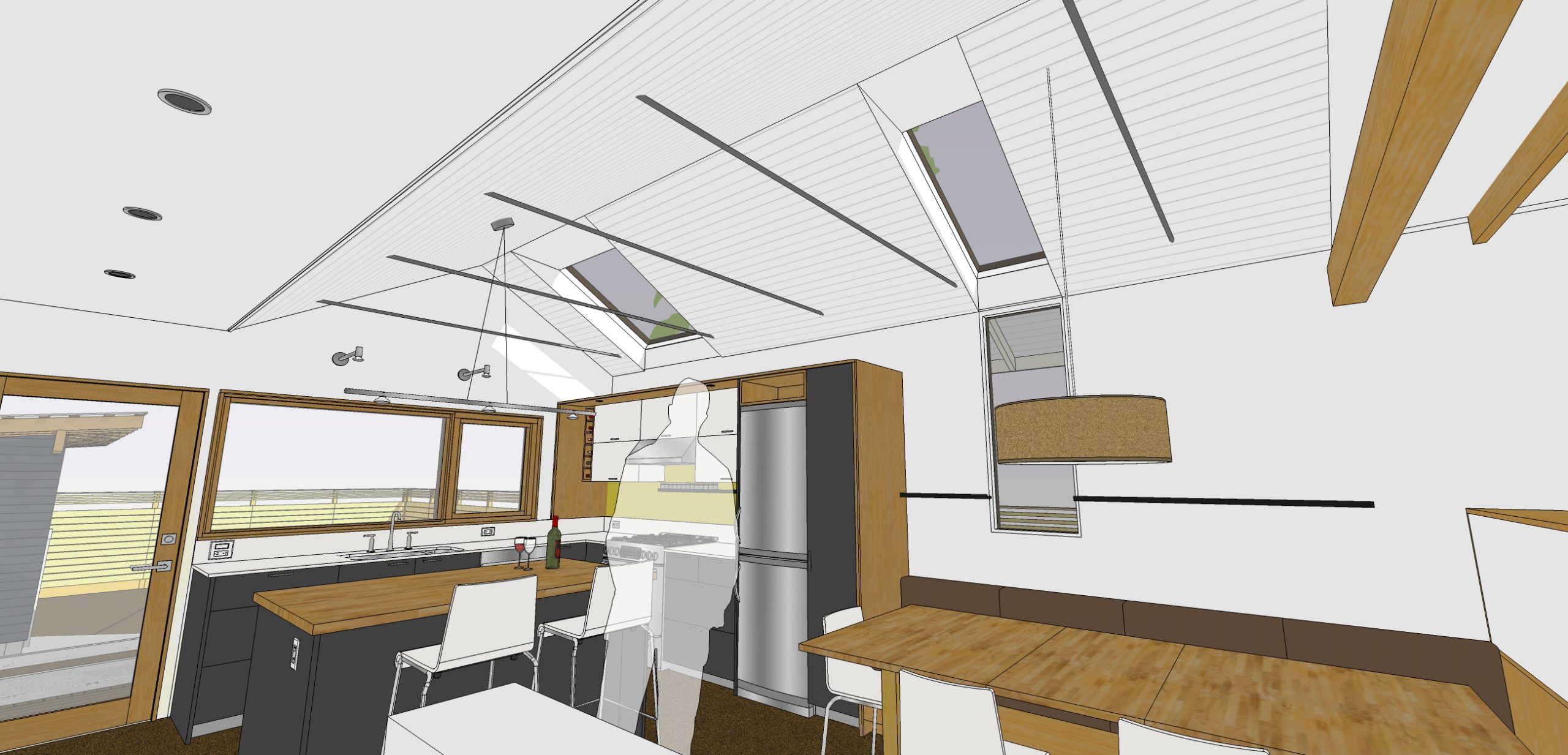
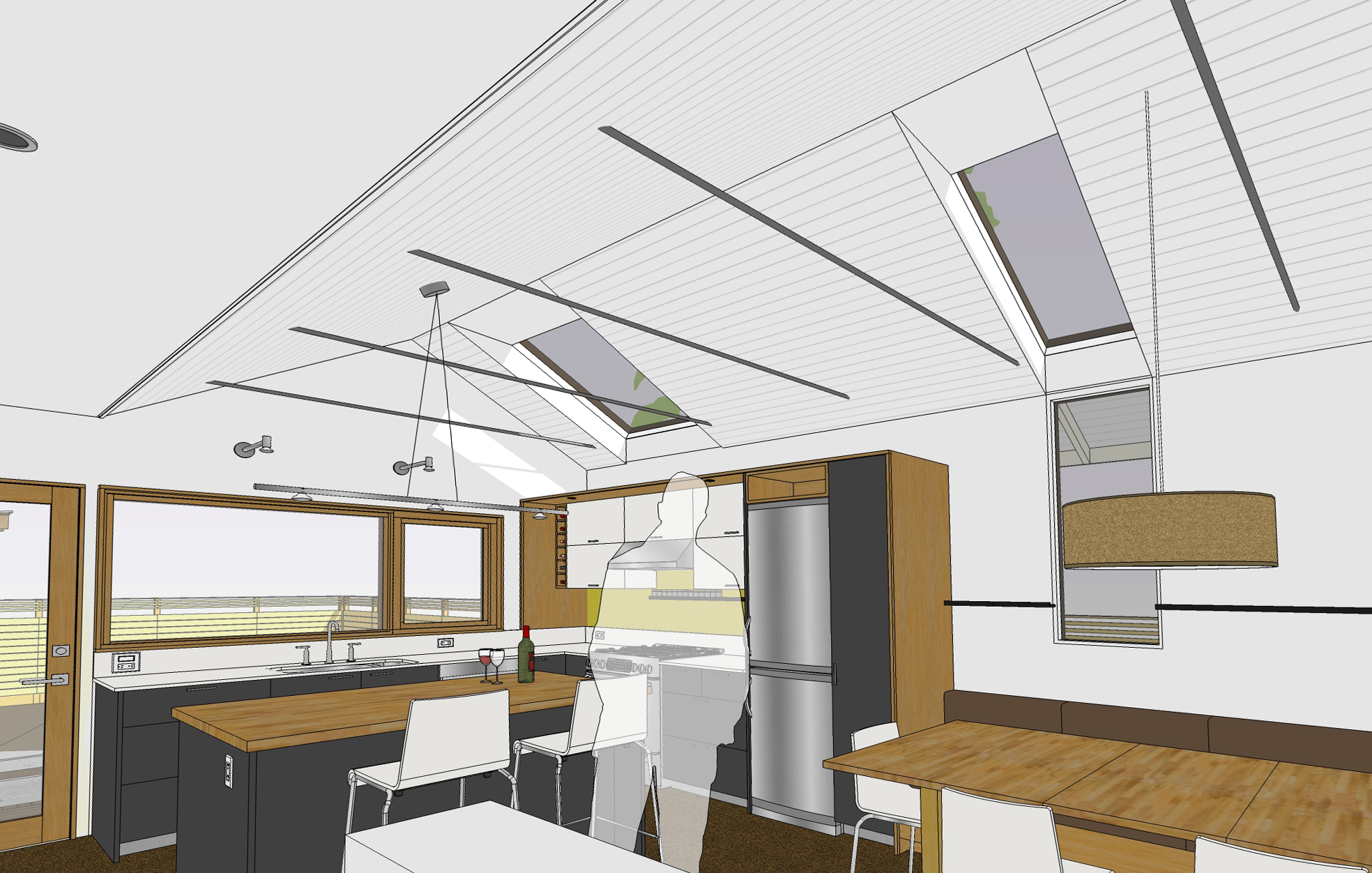
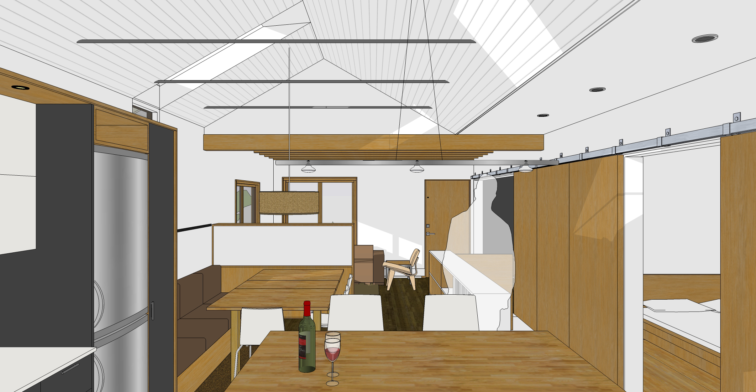
We’ll vault the ceiling over the kitchen and dining area. Not only should this do wonders for general volume of the space, but it also allows us to add some skylights. This is our south-facing wall and in Seattle, we’ll take all the light we can get. The vertical window at the dining area is actually an extra window that’s sitting in our basement. We’d been thinking about a way to try to use it and we like the playfulness of the window-to-skylight composition. The skylight “wells” around the glass will be splayed out in an effort to bounce more light into the space. Ideally, with this setup we’ll be able to avoid turning on lights during the day.
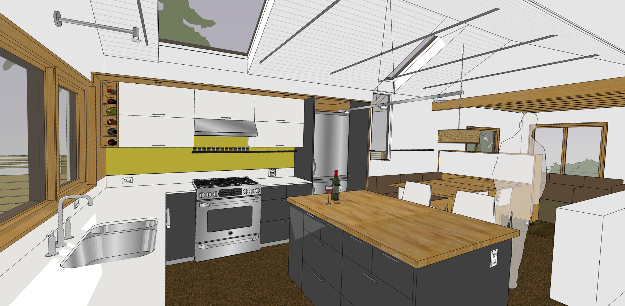
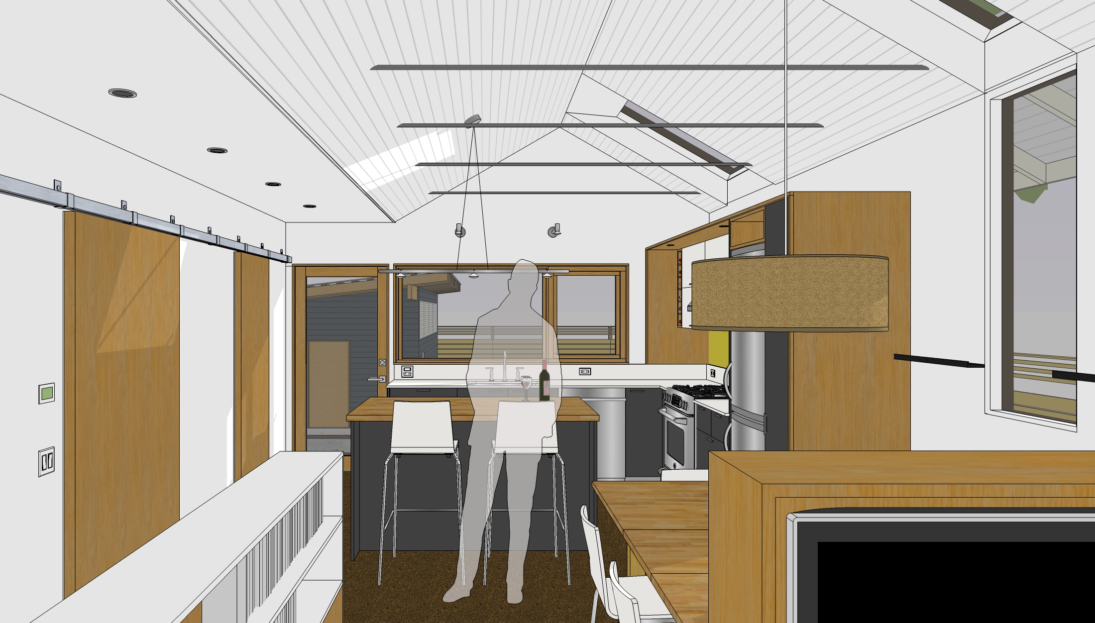
The skylight in the kitchen will frame the view of the large Douglas Fir tree in our neighbor’s yard. The metal picture rail at the back splash is for spices and we’ll extend it (visually) to the dining room wall as a place for art, candles, whatever. We’re still working on the lighting design. We like what we have, but we’re just not sure it’s in the budget. But it’s also important to get it right. We know all too well the effects of really bad lighting.
The steel members at the vaulted area are tie rods, which not only look cool (well, to architects at least) but they are necessary to tie the roof structure together since we’ll be removing all the joists in this area. [Similar to what we did at the front porch.] For the vaulted ceiling, we’re thinking about some type of tongue and groove paneling painted white.
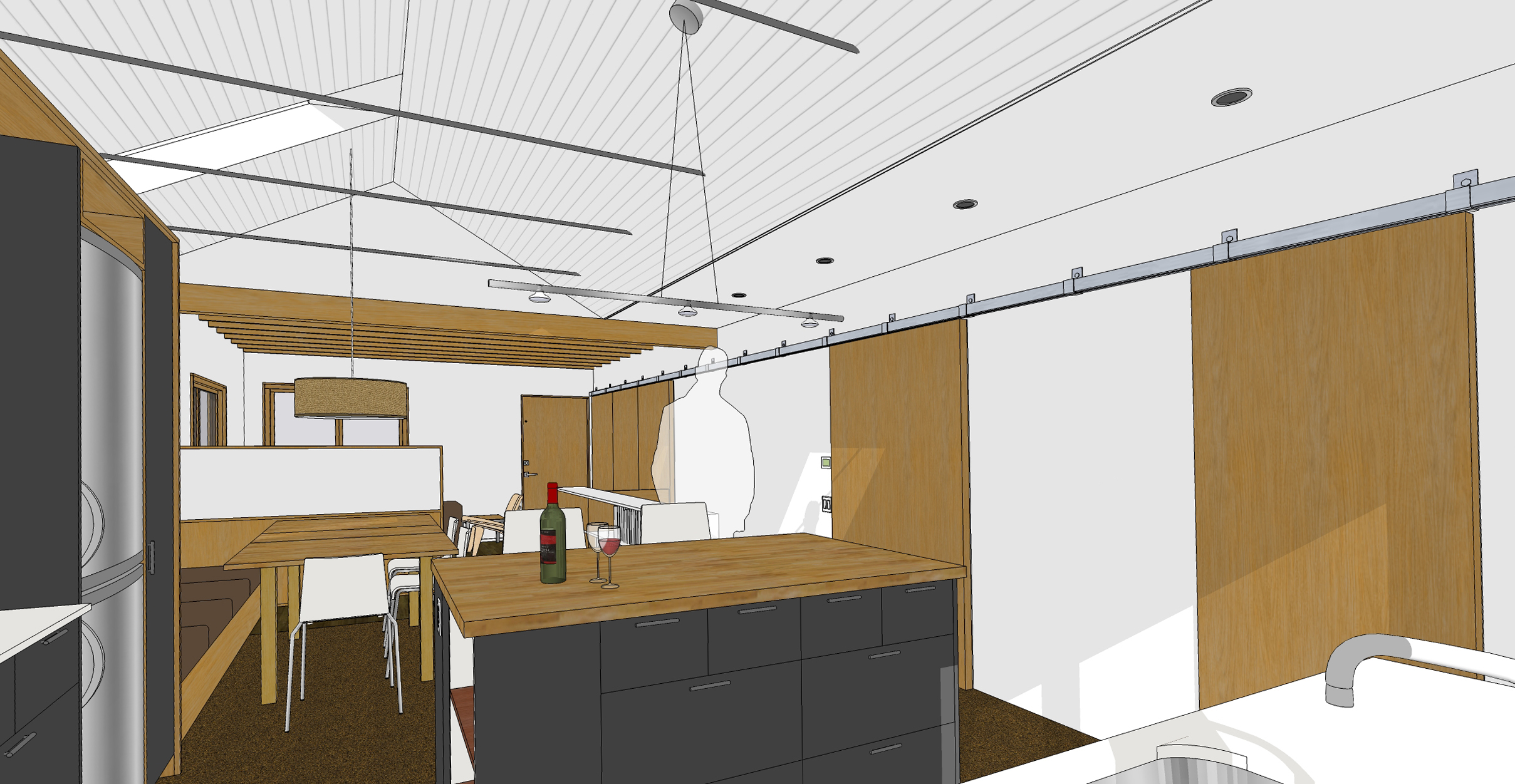
This view is standing in the kitchen looking back towards the dining and living area with a glimpse of the bedroom to the right. [The dark wall behind the translucent man is a peek into what will be the 2nd bedroom.] The built-in bench to the left of the table will have extra storage space under the seat.
A similar view with the sliding doors in their closed position.
And there’s the linen drum pendant we saw in the West Elm catalog! The shelf to the left will double as a guard rail for the stairs down to the basement and a shelving/storage unit. [In a small house, every inch counts!]
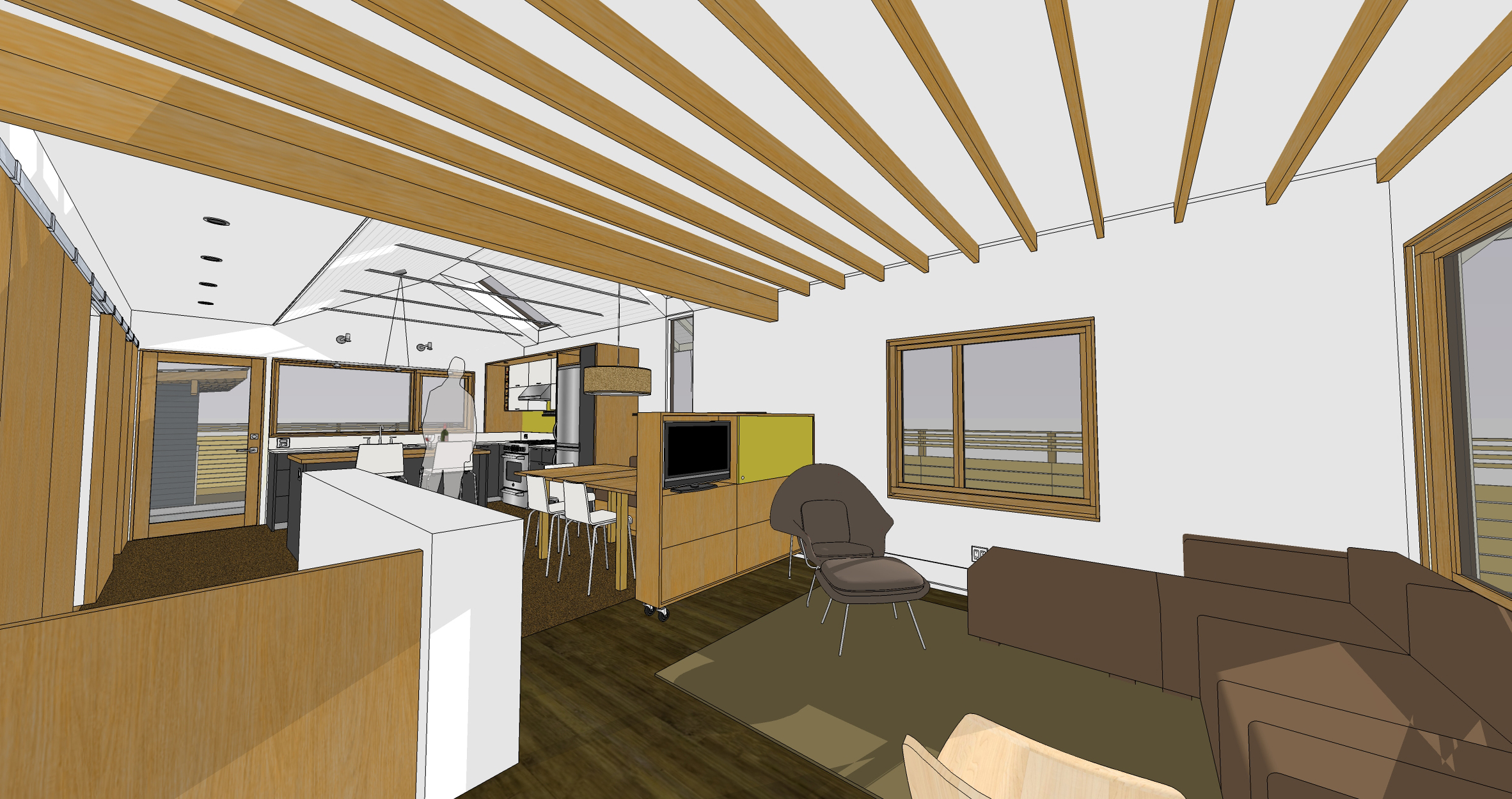
And here we are standing at the front door. In the living room, our ceiling joists run north-south so the plan is to first install plywood or some type of subfloor in the attic, then tear out the lath and plaster and leave the joists exposed. We think this will be an interesting expression of the old house and will add a bit of extra height to the space. The piece of furniture between the dining and living area will serve as a room divider and storage space. (The yellow panel will slide over to hide the TV.) The unit will also be on casters so we can push it out of the way if we need to accommodate more people at the table. [Unfortunately, we don’t actually own any of the furniture in this model (except for the table).] Here’s hoping we find an Eames chair on the side of the road with a “free” sign on it!
So that’s where we’re at. The design is bound to change some more and we still have lots of finishes and materials to finalize, but we really like the direction things are heading.
