It’s been a couple of months since our last Studio Zerbey post, so today we’re sharing another project that is currently in schematic design – a remodel of an existing animal hospital east of Seattle.
A big thanks to Kyle, who is brilliant and created these renderings.
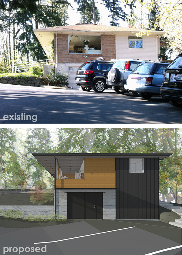
The project is located just south of Bellevue, WA in what was originally a 1950’s home. The house was converted to an animal hospital a number of years ago, but the client requested a series of updates that would reflect their modern sensibility and high-tech inner workings while maintaining a warm and inviting atmosphere. (Also, the zoning code does not allow any changes to the building footprint or massing, significantly informing the design direction.)
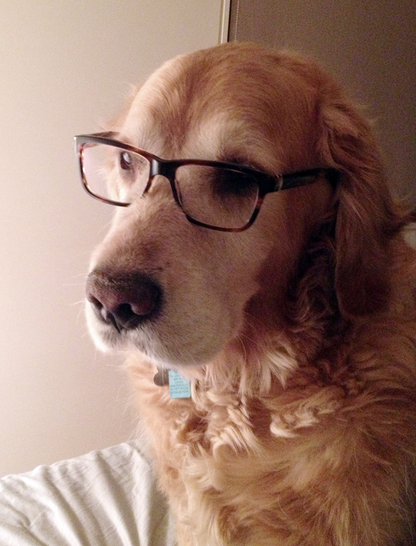
Naturally, we brought in a specialized consultant for the job…
(He gets paid in dog treats and belly rubs.)
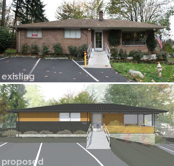
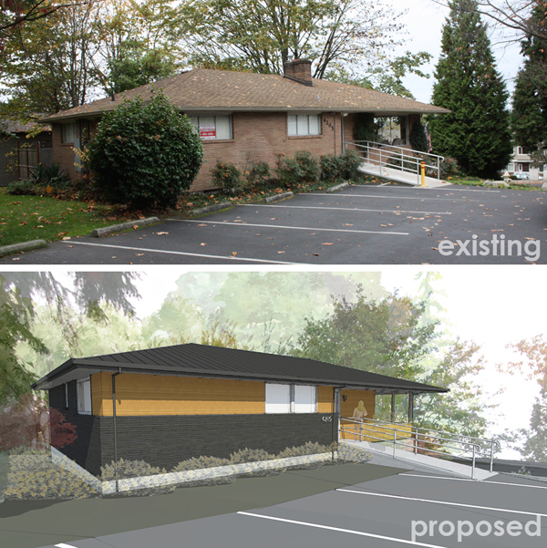
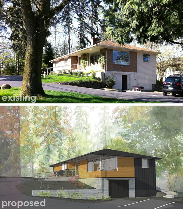
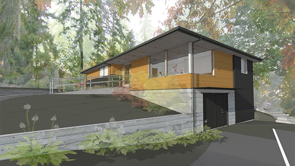
In general, the exterior needed some functional updates with the added goal of steering it towards a more commercial (professional, yet warm) aesthetic. The composite roof will be replaced with a more durable standing seam metal roof and we’re proposing that the existing aluminum windows be upgraded to a clad wood window (or possibly a more efficient aluminum product). To save on costs, we’re focusing mostly on the two prominent elevations (north and east) and leaving the rear, “back of house” elevations much the same (with the exception of paint and new windows). The existing chimney and fireplace will also be removed during construction.
The brick around the reception area will be removed and replaced with a siding material (shown as 1×4 T&G cedar siding here) with a durable finish. Part of this decision was a function of enlarging the windows in this zone as well as a desire to make the entry and reception area a focal point. On the remainder of the main facade, we’re proposing taking the brick down to the level of the window sill. This creates a more proportional elevation and eliminates the fussiness of attempting to cut and patch bricks where windows are being added or taken away. (We experimented with leaving the brick color as-is and doing a darker siding or panel above, but it was too much darkness up top with the metal roof.)
The north elevation is tricky because it is visible from the street but also contains a service entry (originally a garage door) at the lower level. We’re proposing to paint the existing siding and door in the same dark gray as the brick and also adding a steel plate awning to provide protection from the elements and a visual break between the existing concrete foundation and wood siding above. (We’re also exploring the idea of sandblasting the painted concrete back to its original (raw) color.) The northwest corner was “filled in” during a previous remodel and cladded with a cement board siding. To reduce introducing too many different exterior materials, we’re suggesting that this area be resided with a metal siding to match the roof.
We’re also proposing that the existing roof soffit be replaced with a gray panel product that extends into the reception area, creating a better indoor-outdoor relationship and a lower, more intimate ceiling height over the seating area.
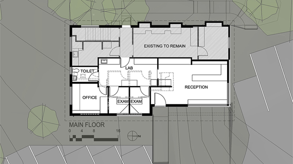
The interior remodel is limited to half of the main floor, including the reception area, lab, two exam rooms, bathroom and office. As shown by the dashed lines, we’re proposing the removal of the old fireplace (which was never used and right in the middle of the space) and a more efficient layout of the other rooms. The animal hospital has made the transition to a paperless business, so space for extensive file systems and storage are no longer needed. The lab serves as a hallway of sorts to access the other spaces, creating an efficient workflow for employees. It’s also the intention of the client that the customers go through this zone to get a glimpse (and appreciate) the inner workings of a small animal hospital.
We’re excited with where the design is headed and can’t wait to share more as things progress.
Now, back to work Bailey!
