I had this post ready to go last week, but got all caught up in the Homies frenzy. Speaking of, you guys totally pulled it off and we placed 3rd in the prelims! That’s huge considering last year we landed in 27th place. We feel so grateful for the support of our readers, friends and family. So again, thank you. We are up against some very popular and well-established blogs and truthfully, we’re feeling a little bit like Bon Iver at the Grammy’s. In other words, we know we’re underdogs in this, but we’re excited nonetheless. So with that, we’d appreciate your vote one more time. The polls have officially reopened with voting ending on Friday (March 9th) at 3:00 p.m. EST. And if you don’t vote for us, at least vote for our friend and fellow indie blogger Daniel of Manhattan Nest.
Now, back to design and stuff. During my purging frenzy in January, I came across a stash of sketches and doodles that I’d saved since we started remodeling our house. (I love me some nostalgia.) Even though we use AutoCAD a fair amount, we always start out sketching. It’s a fast and easy way to think about a concept without getting hung up on technical aspects. After the initial pencil on paper, we usually move on to SketchUp, a free program that’s intuitive and great for quickly visualizing spaces or ideas.
Anyhow, it was fun to look back at early design ideas, so we thought you might get a kick out of seeing where our brains have been these last 5+ years.
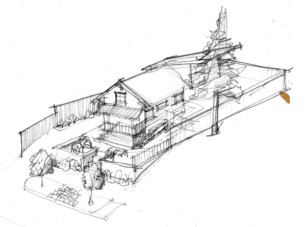
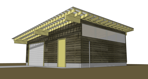
Not long after we bought our house, we were out to dinner one night and (over a bottle of wine) came up with the idea to remodel our garage first. It would be a test run of sorts – a way to explore ideas without worrying about getting it perfect. Well, we eventually came to our senses (err, sobriety) and realized that we’d rather have a nice living space before a nice garage. It would have been a sweet garage though – and it will be, someday (although now we’re toying with the idea of doing a second story as a mother-in-law of sorts). In the sketch above, we were also messing around with different porch ideas and getting a window into our attic space.
Our garage is a clunky melding of 1910 gabled roof with a 1960’s carport tacked on. Although we’ll probably keep the same footprint, everything else has to be redone. Will there be a shed roof in our future? This is the Pacific Northwest…it’s our favorite roof form!
Moving on…our first major project on the house was to tear off and completely replace our roof. (That was the worst project! THE WORST!) At the time, we considered adding a second story but just didn’t have the funds for such an endeavor. A few years later, while planning for the big interior gut job, we thought about a small pop-up roof but also nixed the idea due to feasibility and costs.
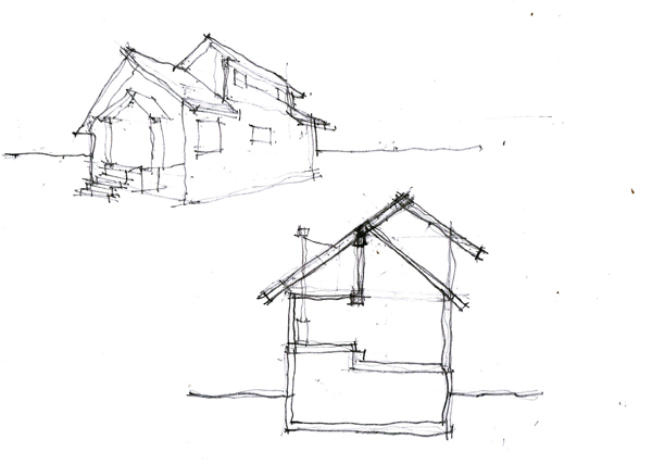
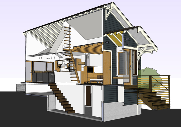
And we don’t regret that decision. Instead, we decided to make the most of the volume we already had. Slicing through our SketchUp model (below) helped us figure out how we could create a vertical shaft that would help tie the three levels together (while also pulling cooler air up from the basement and exhausting warm air out through the loft – hell yeah!).
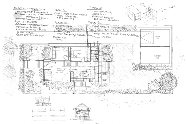
We’ve never really shared this on the blog, but we went through SO MANY plan iterations for the main floor. In fact, we spent the first couple of years fixing small things and thinking about what the hell we were going to do with our small house. For practical and home value reasons, our main objective (other than to make it less ugly) was to add a second bedroom. Easier said then done my friends.
Idea #1 – Add an addition off the back (to the right of gridline 2) that would accommodate a bedroom and big bathroom. (You can see the original floor plan here.) This still felt awkward, didn’t really solve all of the problems and would have been more expensive. (It also would have reduced the size of our backyard.)
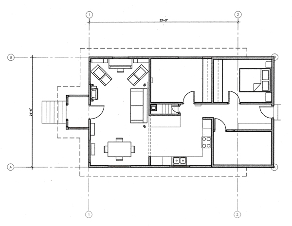
Idea #2: Similar to #1, but a smaller bump-out that wouldn’t look totally out-of-place. Ok, but the second bedroom would be tiny. We also didn’t love how inefficient the kitchen layout was and the entry was still all sorts of awkward.
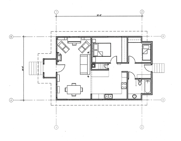
Idea #3: Add a tiny bedroom where the old back porch was and move the kitchen over a bit. We also had this badass idea to do an elevated living room (where the two couches are shown) – by raising the floor framing a foot or so, it would create a cozy living space while providing a better ceiling height for the basement room below. We also already had plans at this point for some type of loft. Getting better, but not hitting the sweet spot just yet.
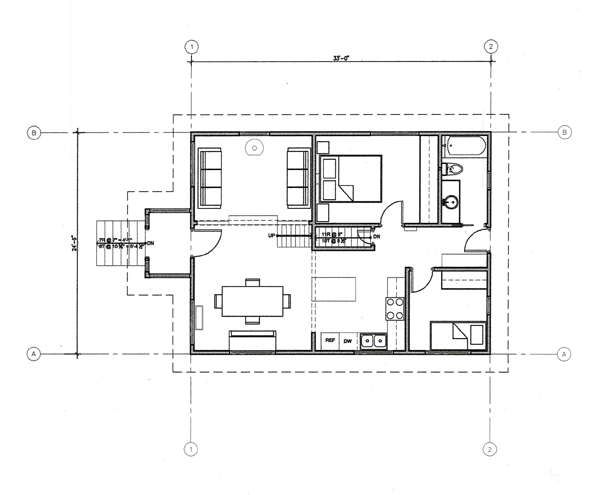
Idea #4: We took idea #3 and shuffled things around – the kitchen went back towards the yard and the second bedroom would be a tiny “flex room” of sorts – essentially a box in the middle of a great room space that could be a nursery or small office. Notice the date on my phasing lists (2007) – WISHFUL THINKING!
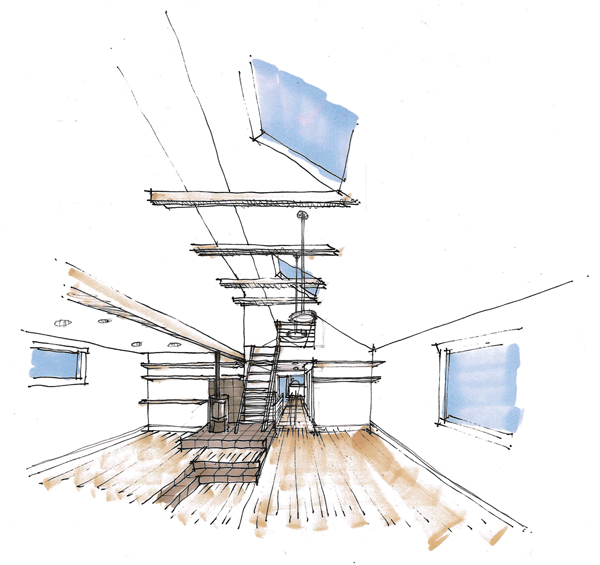
Here’s a sketch Kyle did of our raised living room concept. In this version we had the loft over the back half of the house with a sweet wood-burning stove on a raised slate plinth. Vaulted ceiling and exposed beams – sexy, but way too much framing manipulation for our poor centurion house. Ultimately, we landed on the layout we now have. For us, it was the best balance between economy, efficiency and good design. Adapting old houses for 21st-century living is not always an easy task, but when you finally nail it, you feel like you’ve done a small part in advancing society.

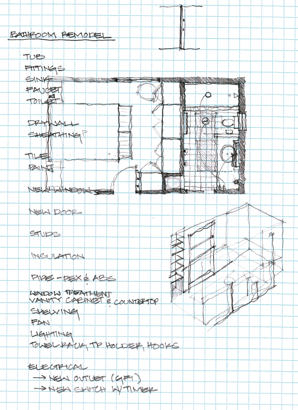
In the random department, this is from our bathroom project in ’08. This is typical of my sketching – notes or to-do lists superimposed on sketches.
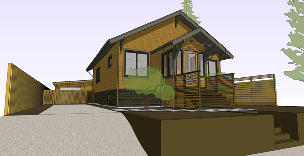
In 2009, we got busy on the exterior. Here’s a sketch I did looking at different color options. For a while we considered keeping the trim natural wood, but that would have been considerably more expensive and we’d already done the roof. We did end up with a gray-blue paint color, but darker. Sootier.
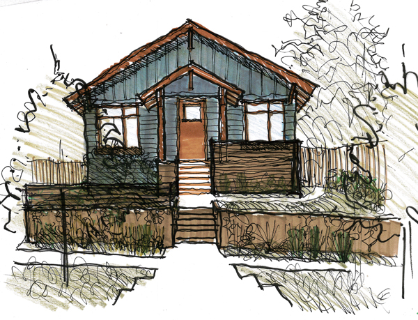
See what I mean?
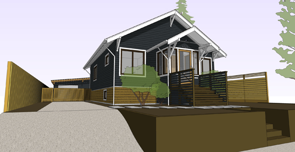
Through the powers of SketchUp, we also explored a few other color combinations – at the time we had a thing for ochre (a close cousin of our BFF mustard yellow), but it just didn’t feel right. We needed something that would contrast more against all the wood and brown colors elsewhere.
We’ve also given a lot of thought to furniture, mainly pieces that are built-in and/or do double duty to make the most of a small house.
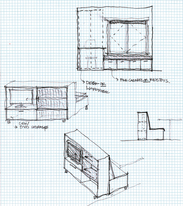
At one point we considered a built-in banquette for the dining area with the backside of the bench seat being a media cabinet for the living room. Once we demolished our space we decided that there wasn’t enough room to warrant something like that. Again, a good call in retrospect. The sketch at the top was an idea to build something in the flex room that could work for a home office and then a nursery. Well, this remodel stuff always takes longer than you think so we decided to just skip the home office phase and DIY a kid instead.
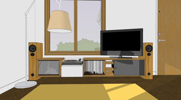
In lieu of the banquette/media cabinet, Kyle designed this low-slung unit (probably sans TV though). It was going to be built last year, but we continued to futz around with the design and now it’s on the back burner so we can make time for higher priority projects.
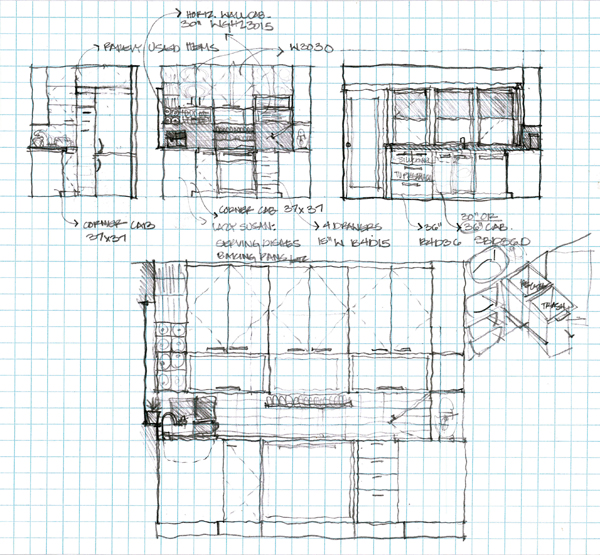
For the kitchen, we both did a lot of sketching. With a blank slate before us, we wanted to make sure we were thinking about every little detail. Obviously, this wasn’t the final version but going through the process was invaluable. (On that tangent, always a good idea to hire an architect, especially for small spaces that require a high level of efficiency!)
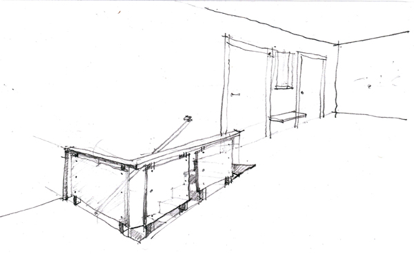
Before the stair cabinet fauxdenza or the loft, Kyle did this sketch of a possible stair guardrail. We were also going to do a little bench and message center of sorts between the bedroom and bathroom, but that was before the sliding door concept came to fruition.
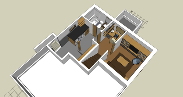
I did this SketchUp model for the basement, oh…about three years ago. It’s close to our final plan, but instead of a little nook with a desk, we’ll probably do a linen closet of sorts (since the desk will now be in the loft). For now we’re just focusing on the right half of the basement – the laundry room and second bathroom will have to happen later.
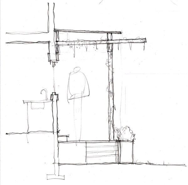
Last spring, we were exploring design ideas for the back deck and awning and Kyle did this sketch. As you may recall, the deck got a bit (ok, a lot) bigger and we still haven’t built the awning. (This year? Maybe?) At any rate, the design challenge here (as it is with any building in Seattle) is how to provide protection from the rain while allowing light through. In our case, it also provides a way to BBQ the other 10 months out of the year. So yes, the awning design needs a bit more thought and we still have steel panels laying in our driveway, ready to build that second planter box. Good thing our future daughter isn’t going to care about the backyard for a while.
So there’s a snapshot of the last 5+ years of our life. Yeah, we’re having fun.
i LOVE your sketches. i too sketch and design first through pencil. i so appreciate the hand of man in this digital world. i’m always trying to find ways to add the human touch to my computer generated drawings. kudos to you for keeping sketching alive.
i’ve been voting for you two on the homies. love your sensibility and frankly am so impressed that you hold down full time jobs, in full remodel – with child have time to weld and blog. kudos to you two.
But how can I seek to ruthlessly destroy you when you’re so lovely and smart and nice?!?! ARGH.
You guys are always so (so!) impressive with everything you’ve done to your place, and it’s great to get a peek into how you conceptualize things before you go for it.
I’m so glad you guys are in the Homies—well, well deserved. xoxo
If I have the money and you guys are up for it, I will hire you to plan and design my house. You guys have impeccable attention to detail and I feel like you never rest until you have achieved to meet your vision.
You guys are amazing!
THANKS for sharing all your thoughts on the house here with these lovely sketches. And thumbs up again for the Homies award.
Can we hire you to accompany or remodel our 1873 house here in CH? 23 architects have so far rejected the project – not much interest for remodel here with shoebox-type-building being the trend at the moment …..
Do you allow me a question about the basement sketch? Is it still in plan to have the bathroom only accessible from the bed-/guestroom through hall and laundry and having to pass 3 doors?
Haha! DIY a kid instead. Funny. : )
Thanks Kurt! Glad to hear there are other proponents of hand sketching – it’s so important!
I know, I’m so torn…if we don’t have a good chance of winning then I’d rather people vote for you. But I also don’t want to be dead last. WAAAAAHHH! We need an endorsement. (Obama, are you reading? A solid 4th would be ok.)
Hi Isabelle, it’s Monday morning and I might be a bit slow, but where is CH?
Good catch on the basement plan, we’ll have a door to the bathroom directly off the hallway at the bottom of the stairs instead of going through the laundry room.
The results look effortless, it’s so interesting to see how much time and how many iterations the design process involved.
Thanks for sharing this. It’s great to really see the process behind the product, and generous to your readers! A good reminder that good design doesn’t just happen by itself, and even (especially) for a small job like a tight kitchen, you need an architect! That sketch up cross section makes for a beautiful drawing…
Zulily (similar to groupon for babies) is having 40% off babymod products… thought you might be interested.
Awesome. What rendering software do you guys prefer?
Hi Guys –
I just found you through the Homies thing and I just wanted to say that you guys are amazing. So freakin inspiring and talented. Also – I’m pretty much green with jealousy over your baby girl – even if she is still in a uterus. I want one (a girl, got a uterus already). Sorry – I have a tendency to make things awkward – I apologize.
Just wanted to tell you best wishes with your big adventure – I’ll be following in my reader 🙂
xo – kb
CH = “Confederation Helvetica” = Switzerland. Sorry, as Switzerland is such a long word, we all use CH instead ;-)))) Zurich is where our little house is.
And thanks for mentioning SketchUp, because I would like to be able to “scribble” digital. The architects had problems understanding my drawing efforts. ;-))))
Ha, got it! You should definitely checkout SketchUp, there’s a free version from Google and lots of tutorials to get you going.
Thanks Katie! Whoa…I just checked the current vote count. Girl, you are killing it! Congrats!
i’m a big fan of yours. i’m sorry to say i had to give my vote in the homeys to an ironman who breaks long posts up to post daily with projects large and small tackled and completed. the long distance runner always gets my vote. it’s nice to have this post but, well, where was it the three years i was checking daily?
Thanks Jeannette, I’m not sure I totally understand your comment, but I know there are other blogs that are people’s full-time jobs and have a lot more frequent content (and obviously it’s totally ok if you want to vote for them). Since Kyle and I both work full-time, we only have so much free time to design, execute and document our work, but we do our best to post once or twice a week.
you a great job; the person i’m thinking of has a full time job too.
thanks janis, if you’re interested just e-mail us at info@chezerbey.com
we model in sketchup for the images you see here;)
HA! Sorry, didn’t mean to come across like the type of person that can only read pictures. I was curious if you guys use any rendering plugins with sketchup, your models look so much smoother and full of life like light compared to mine… Anyhow, thanks for your time, and all the delightful posts!
haha, oh right, really I don’t really use plugins but I’ve played around with kerkythea which you can see in this post. http://zerbey.wpengine.com/2010/04/07/kitchen-visualization/ really all the other renderings are just using the standard sketchup shadows. I think the key is to experiment with using jpegs as materials without overdoing it. There’s a fine line between having a rendering that looks almost too real but not quite enough so I tend to go towards whatever is simpler and get on with actually building it 😉 -cheers
Sage advice sir! Much appreciated.
I love seeing the “almosts” from a good before and after.
houseofthebonestorm.blogspot.com