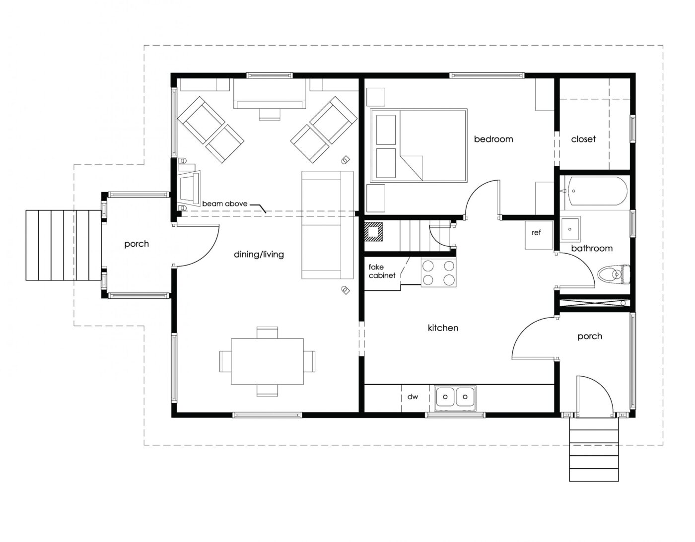
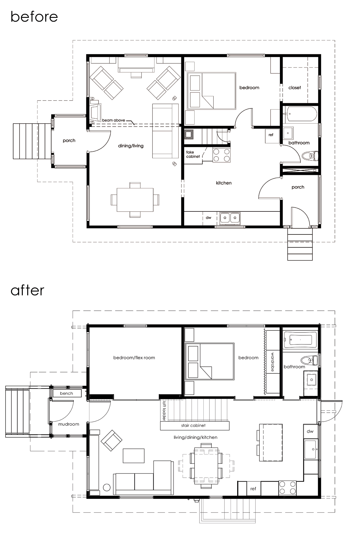
Construction on the main floor is more or less done, which means…time to update the floor plan! We made a few changes post-demo, mainly with the addition of the loft, the stair cabinet and tweaking the furniture layout. But just for fun, here’s a reminder of what it looked like circa 2008. [Click to enlarge.]
And here’s what it looks like now (the living room is still empty, but not for long). In an earlier plan we had a bench seat (with storage below) along the south side of the dining area. We ended up nixing the idea so we could have the flexibility to rotate the table either way depending on our mood or the amount of people over. (For Thanksgiving and other bigger events, we have a card table “extender” that can go on one end. With a tablecloth over the top, you can’t tell it’s two pieces.) We also opted to put the media cabinet along the west wall of the living area, instead of a low piece that separates the living and dining area. The second bedroom/flex room is still a question mark. It seems silly to put an actual bed in there so we’re thinking of just leaving our current couch in the space and if we have 2+ guests we can bust out the plush Aerobed. It’s not fancy, but our remodel funds are super depleted so that space is going to stay flexible for a while. Eventually, we’d like to add another wardrobe and maybe one of those fancy couch-bed things. Ok, a futon. But not the kind you had in college. Anyhow, I love that we were able to add a bedroom and make it a million times more functional without adding any square footage (the main floor is about 800 SF including the mudroom). We went through tons of floor plan iterations (maybe we’ll show those someday – it might make for a good laugh), and ultimately landed on what you see above. Not only did we have to come up with something that worked, but also something that could be phased over time while we lived in the house. Sure, there are inherent challenges with reworking a small, 100 year-old house, but we’re pretty excited about living in this one.


