Hello!
Has it really been over two weeks since I last posted? All is well in the Zerbey household but we have been busy enjoying Miss Avery (which I like to say with a southern drawl) and showing her off to various friends and family members. We also celebrated Kyle’s 34th birthday! The day was way more low-key than last year, but we did go out to breakfast and I managed to sneak off and pick up a small ice cream cake to celebrate that evening.
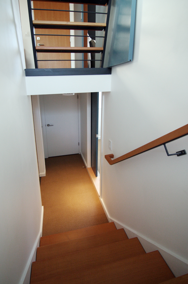
My mom was also in town to help out last week and in our ridiculous DIY fashion, we finished the basement just hours before her flight arrived. Finished being a relative term of course. Fortunately, our newborn was very amenable to the last-minute construction (I think we have our in utero remodeling to thank for that) and slept peacefully through the chaos.
But enough chit-chat, come on downstairs!
[Need a reminder of how scary the basement was when we moved in? Oh the shame.]
Our first week at home found us balancing the basement project with caring for a newborn, so there are virtually no progress photos. But to be honest, the tasks weren’t that glamorous – painting, trim, electrical, carpet tiles…been there, done that. Yawn.
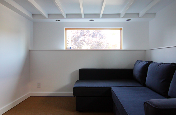
So let’s just jump straight to the pretty pictures, ok? The week before our family expanded, Kyle and I went to IKEA to scope out sleeper sofas. After trying out every one they had (which was probably pretty comical at 9 months pregnant), we decided on the Manstad. (Or as my sister calls it, the Transformer Couch.)
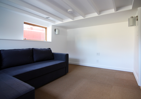
It comes in a beige or blue-gray color, but we went with the latter because you can never have enough blue-gray in your life. Also, we thought it would show less wear than boring beige. [As we shared in this post from way back in January, the plan is to eventually add a storage/media unit along the blank wall in the photo above.]
The design for this sofa is quite different from the other IKEA options. Unlike most sofas that fold out along the long side to create the bed, the Manstad has a hidden piece under the main portion of the sofa that pulls out to effectively “fill in” the shape formed by the chaise. Like this:
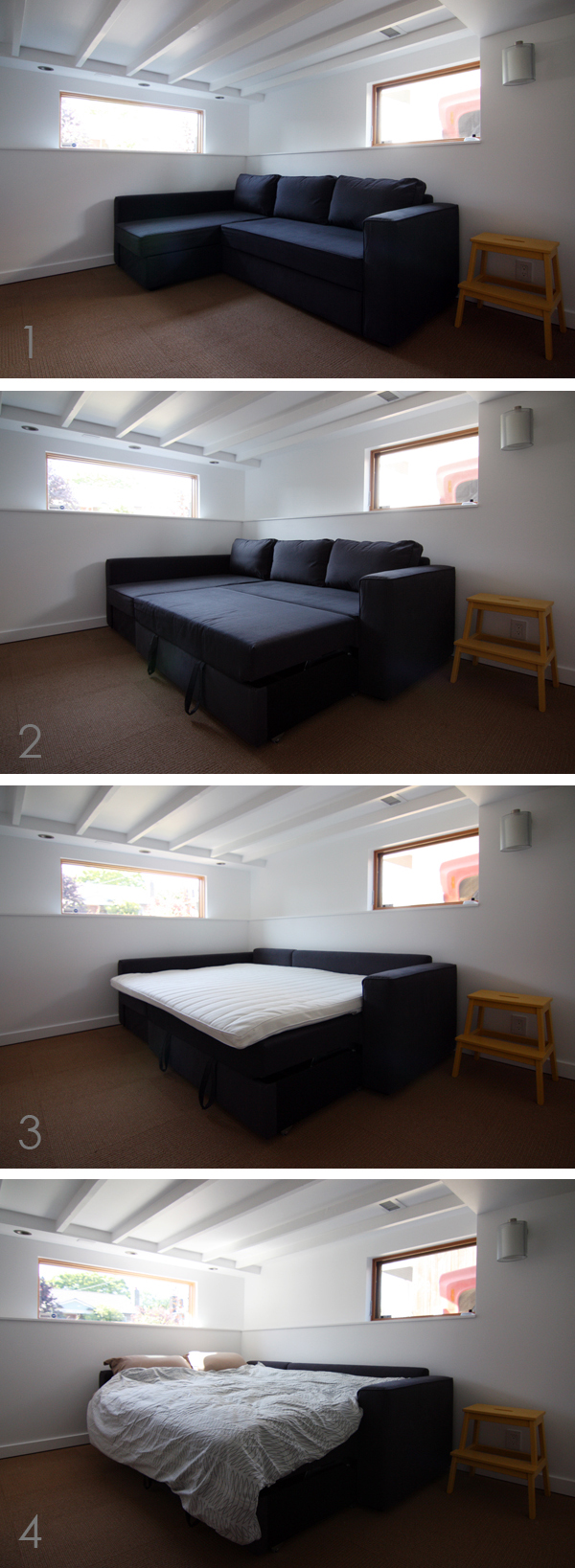
For us, we liked that the sofa configuration had a chaise (which can go on either side) and that the bed was elevated and not close to the floor like many of the other models. The only downside (and this applies to most IKEA sofa sleepers) is that it wasn’t terribly comfortable. After going back and forth (literally) between the sofa and bed departments, we decided that the best solution would be to buy the sleeper sofa and a memory foam topper to provide a little extra cushion. (Annoyingly, IKEA sofa beds are somewhere between a full and queen in width, so the queen size topper hangs over one side by a couple of inches.)
The topper is light enough to move easily and when not in use we’ll just roll it up and store it in the adjacent closet. The memory foam (which is only a few inches thick) does make a big difference and got the seal of approval from my mom.
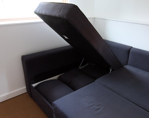
Another nice feature is that the chaise cushion pops up to provide extra storage space for linens or the sofa cushions depending on what configuration it’s in.
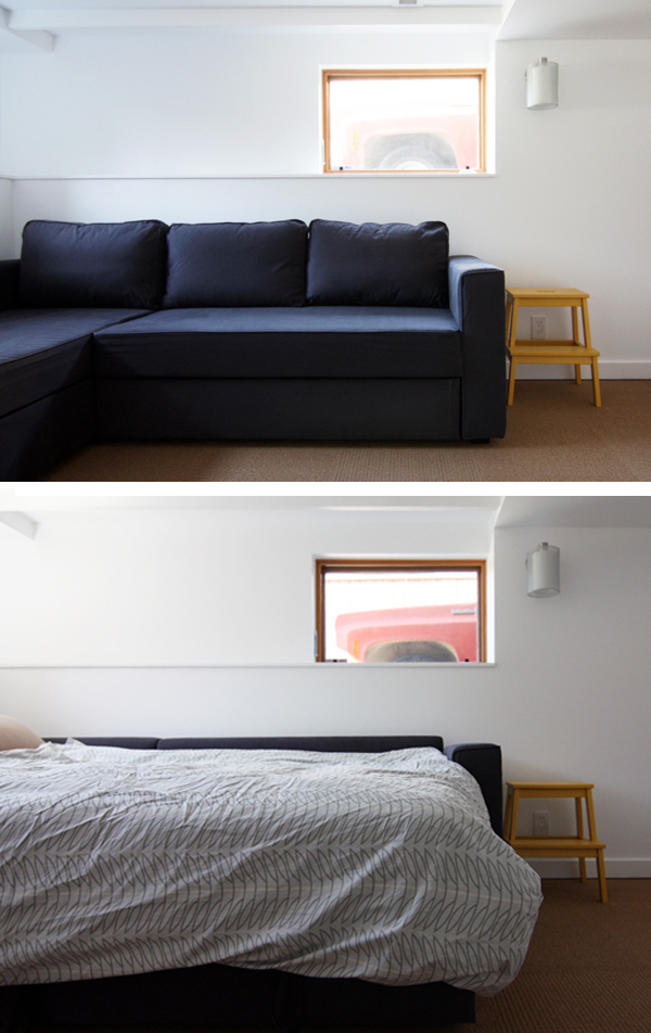
Sofa. Bed. We love how easy it is to go from one to the other, without one of those weird metal frames to wrestle with or awkwardly folded futon mattress.
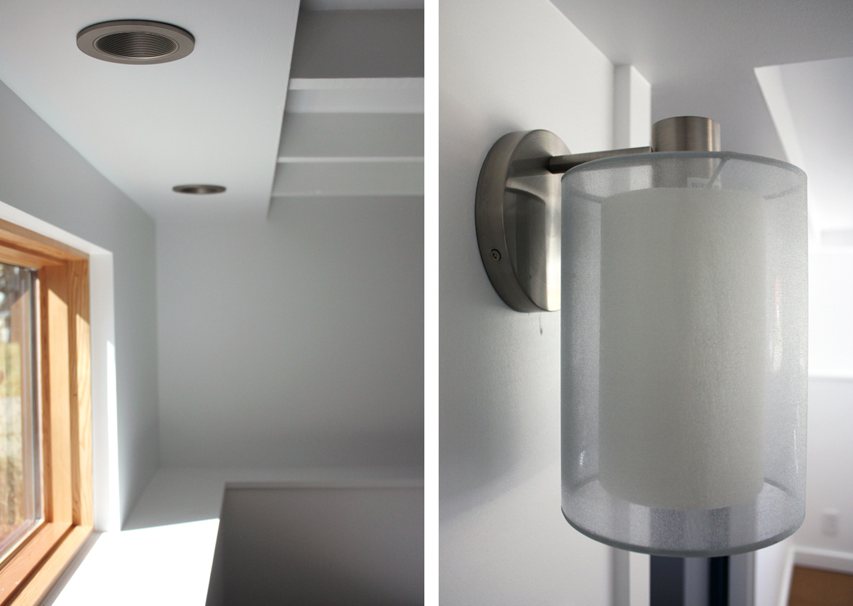
With a low ceiling height, we were limited to wall-mounted sconces or recessed cans for the room’s lighting. We placed three cans along one end for general/task lighting, with the idea that this is where people will be sitting our laying down. The two sconces are on the opposite end and will flank what will eventually be a built-in media/storage unit. Finding well-designed yet affordable lighting fixtures has always been a challenge for us and Kyle must have gone through dozens of options for this space. Finally, he found these sconces, which cost about $120 each (with our trade discount) from our local retailer, Lighting Supply. They have a nice diffuse light and are appropriately sized for the space. We also ordered dimmable CFLs because you know how Kyle likes his dimmers.
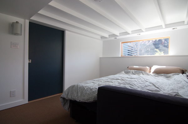
The two windows still need a proper shade (we got classy with some cardboard for my mom) and we’re currently pricing out different options. We plan on installing some type of blackout shade for optimal movie watching and daytime napping. [Side note: this space is significantly cooler than the main floor, which has been a well-timed blessing during our “heat wave” this week.]
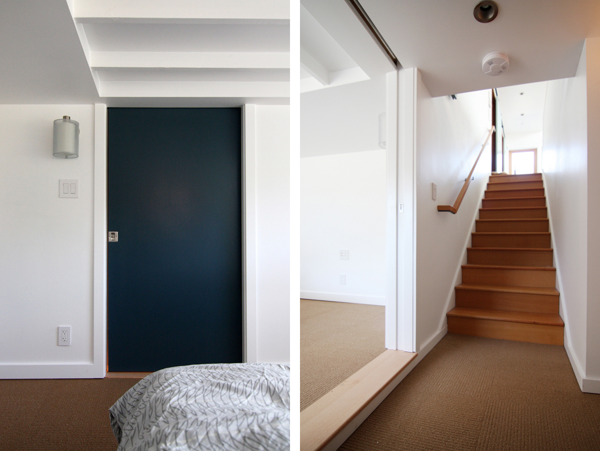
To make the space feel as bright and airy as possible, we stuck with our go-to paint color (“super white” by Benjamin Moore), but decided to mix it up for the doors. We had some leftover paint from our sliding barn doors upstairs, so we painted the future bathroom door the same “Thunderbird” as the other bathroom and the bedroom door the same “Lakeside Cabin” as the nursery. Or so we thought. About halfway through painting the sliding door (which was a real chore since it had to be done in place) Kyle realized that it was actually a completely different color (“Spellbound”, to be exact). Neither of us could really remember, but I guess we bought it as a contender for the upstairs doors. After about 2 minutes of discussion, we decided that we liked it and that it didn’t matter if it matched the other doors.
This project has really honed our ability to make quick design decisions.
The carpet tiles are Flor and from the “Flats and Cords” line (though it looks like they no longer have the same neutral brown color, which was on sale when we bought it). This was another decision that was made quickly and without a lot of discussion – basically we picked the least expensive tile that was rated for at least medium traffic (but was still comfortable for bare feet) and in a neutral color that could work for the room as it evolves over time. So far, so good.
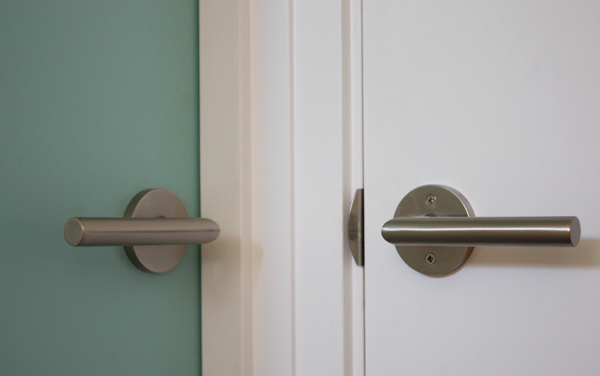
For the swinging door hardware, we stuck with our favorite Stuttgart levers from Emtek. We’ve been very happy with our exterior door levers and Emtek is really reasonably priced (we bought ours locally through Frank Lumber, but they are also available from The Hardware Hut).
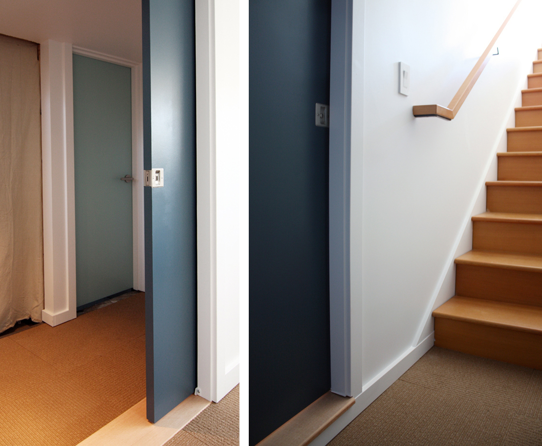
For the threshold between the bedroom and hallway, Kyle cut a piece of 5/4 vertical grain fir to fit. (It’s bare wood in these photos but is now in the process of being finished.) At the doorway to the laundry room, we hung a temporary curtain for the time being. We’re still deciding whether we’ll eventually want a swinging door between the two spaces or just a simple framed opening.
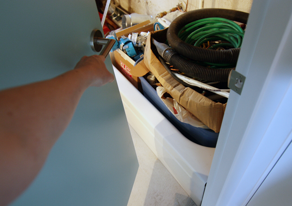
Even though the bathroom door is done, the space beyond is definitely not. Phase two.
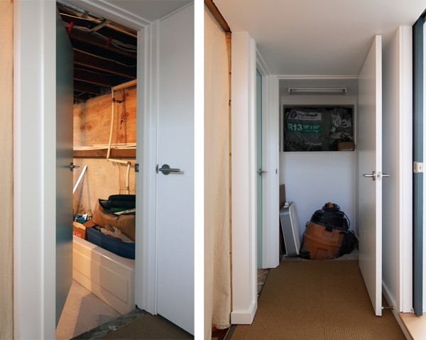
The small closet between is currently holding insulation for the other half of the basement and the shop vac. It’s so exciting having a closet. I spent at least 38 seconds opening and closing the door just for the hell of it.
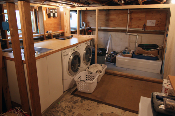
The other half of the basement got a little love too. After misplacing a bag of electrical supplies and spending a good hour searching for them, we decided it was time to organize and clean up the disaster zone on the other side of the curtain.
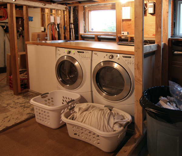
It felt so good to be able to see the floor and the top of the counter again. Although we’ll eventually paint the concrete floor in the laundry area, for now we just put down an IKEA sisal rug that we already owned…which means no more putting on shoes to do laundry. Yay!
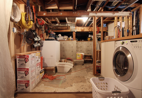
Sadly, we never did find the missing electrical supplies.
Of course, there are still lots of little details to be completed, but at least the bedroom/den space is functional. In addition to window shades, we need to figure out and install a custom storage/media cabinet. We might also add a lounge chair opposite of the sofa and maybe move the coffee table down there. The end goal is to create a space that can work both as a place to hang out and watch movies as well as a guest or kid’s bedroom.
With the framework complete, it’s now time for the fun part. After we finish the bathroom and laundry room that is. Is it time to make a 2013 to-do list yet?