We’ve been making progress on one area of our house and surprise – it’s not the basement! Which can only mean one thing of course – yep, we were able to get another extension on our building permit. When I submitted the request I asked for a couple extra months and was excited to see that instead they gave us till October. A few days later, I realized it was October 2015. Guys, if we have not closed out this permit by October 2015, someone please stage an intervention!
Anyway. The bedroom! You may recall this post from October when we first talked about our grand plans to re-remodel the space (we first tackled it in 2008) and then there was this post from November about choosing paint colors. Well, those paint swatches lived on the wall until about 3 weeks ago when we finally decided to commit to finishing the room.
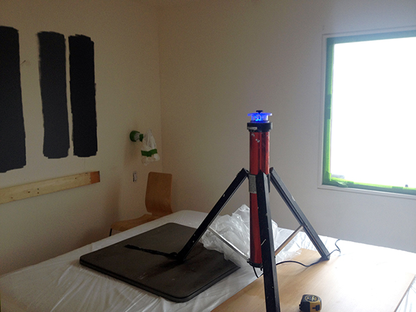
I managed to snap a few crappy photos on my phone of the progress, but we didn’t feel it was super important to document the process. Spackle, sand, mask, paint…ho hum. (We also completed most of the work in a single weekend, so it was very go-go-go.)
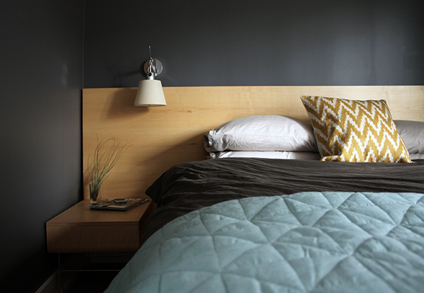
There was no good reason for the delay other than it just wasn’t a necessity project. Kyle had already fabricated and installed the new headboard (which we uninstalled to paint as seen in the photo above) and we’d purchased the Flor tiles, decided on a paint color and bought the curtain track hardware for the wardrobe. Honestly, I think it was all the prep work that had us dragging our heels (that and the fact that Kyle and I both generally hate to paint).
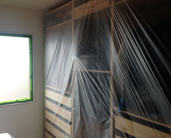
We decided to leave the bed in the room and cover it (along with the wardrobe). This worked fine although painting between the wall and the wardrobe was a little challenging.
I should also mention that Kyle was awesome and did 95% of the work in here while I kept a curious toddler at bay and maintained my long-held role of “finder of things” and “extra pair of hands”. I painted Avery’s nursery while pregnant and could have kept up the tradition but underestimated how difficult it would be to paint during nap time and after bedtime only (especially when my bedtime seems to be about 30 minutes after Avery’s these days!).
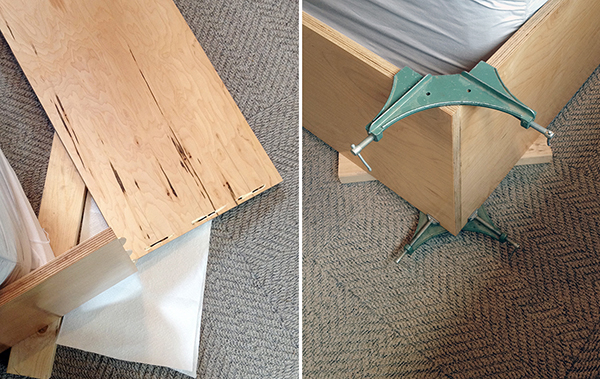
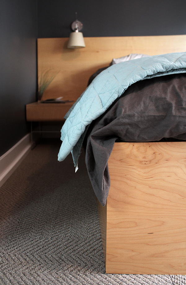
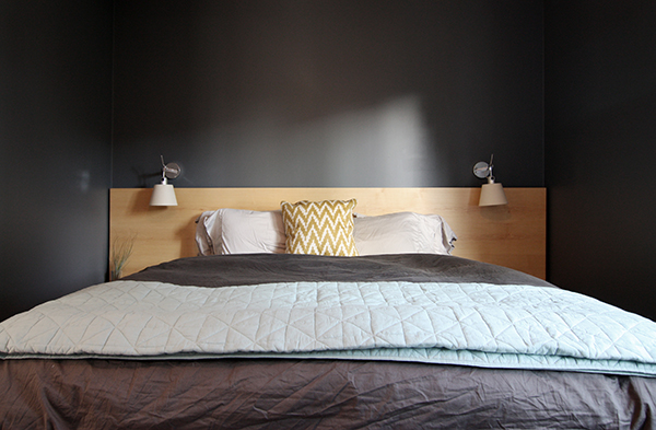
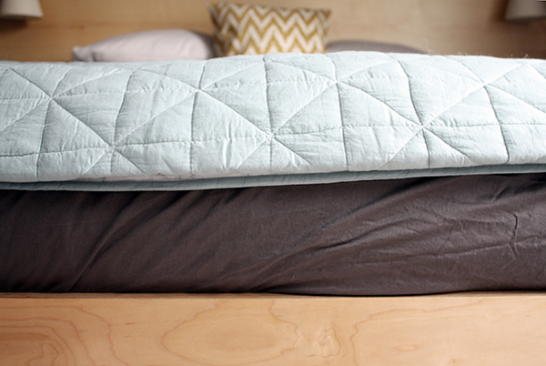
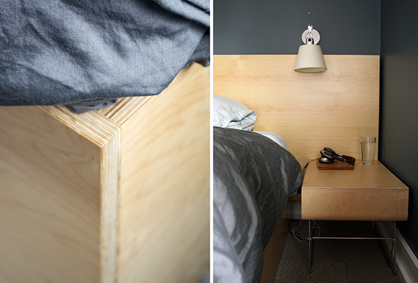
One more progress photo before we get to the big reveal. We got a new (bigger) bed last year and had to get rid of our old headboard and frame. The new bed came with a simple metal frame so we opted to add a custom DIY maple plywood skirt around the three exposed sides (after painting and installing new carpet tiles). The joints are biscuited and glued at the corners and for now the assembly is just sitting on the floor. Eventually, we’ll attach it to the metal frame at the head.
Although most of the wood in our house is fir, we opted for maple in the bedroom to change things up and better match the existing IKEA PAX wardrobe.
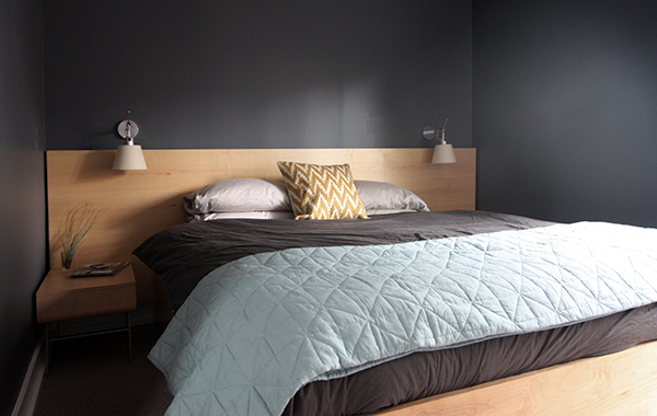
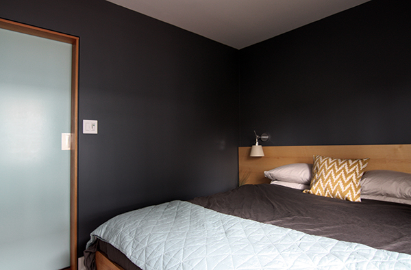
A few accessories later and here we are! We still need new night stands – these are actually the discontinued Offi TV stands that we bought in 2008. We like them but had to turn them 90 degrees to fit which is a little awkward. Sadly, we haven’t been able to find any that we liked and could also afford (ahem, like these Blu Dot ones in “smoke”). There’s always the DIY option but again, too many other projects taking priority at the moment.
We’d also like to do something above the headboard. A single piece of art doesn’t seem like the right solution so we’ve been thinking of a narrow ledge for smaller art and objects (that can be changed out similar to what we have in the dining room) or maybe something more three-dimensional like a textile or sculptural piece that stands off the wall. I’m also ok with maybe doing nothing – I kinda like keeping the color on the bed and pulling the eye down towards that. I think it helps maintain the horizontality of the headboard.
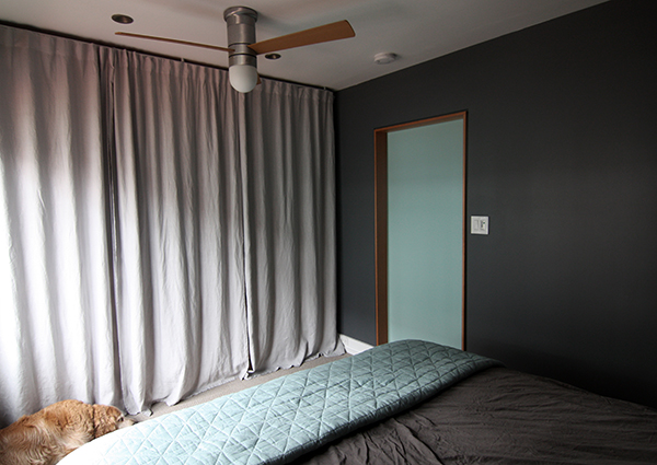
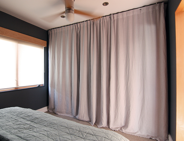
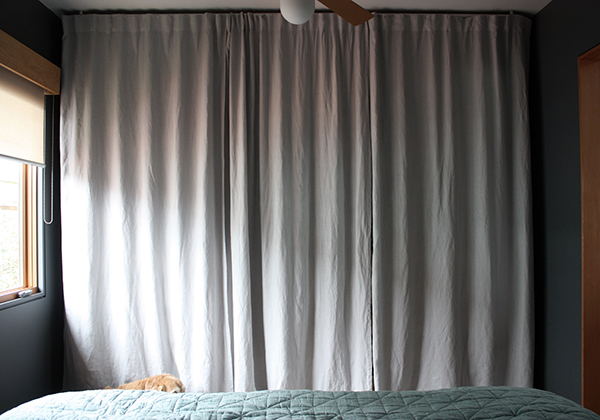
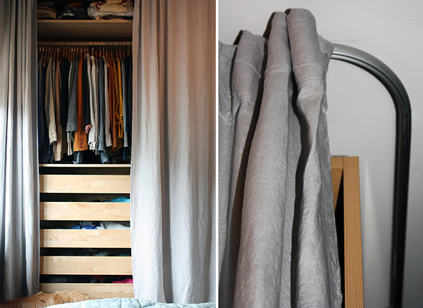
We never really loved the curtain and track solution of the previous remodel (an IKEA tension wire and two brown curtains). We considered adding custom doors instead (either DIY or Semihandmade) but this would have been a more expensive solution and we would have had to move the fan/light to accommodate a door swing. After installing the ceiling-mounted KVARTAL track in Avery’s room, we decided to give it a go in our room. We were even willing to go with custom drapes (with a color! or a pattern!) but could never find something that we both liked. So in the end, back to IKEA. This time we used three panels instead of two which works so much better. (The middle unit mostly houses dirty laundry, jeans and other odds and ends so we were ok with this solution.) I think the lighter gray compliments the darkness of the walls while feeling airy and bringing some lightness to the space. I was worried that the linen material would be too transparent but that hasn’t been an issue at all. (Yeah, they could be hemmed a little bit. I washed them in hot water and was excited to see that they shrunk the perfect amount…until I ironed them. I’ll get to it.)
The paint color is Benjamin Moore’s “Ashland Slate”. It’s not quite as dark as Avery’s room (where we used BM’s “Baby Seal Black”) but we really like it. Kyle did two coats using BM’s Aura line and finished the whole room in just under a gallon.
The plywood skirt hides the bed frame and box springs but is still short enough that we’re not hitting our legs on it when we get in and out of bed. Although we’re all about using every inch of space in our house, the bed frame is low enough that we couldn’t get much usable space under there anyway (it had mostly become home to dog hair and errant tennis balls). This detail also allowed us to run the carpet tiles only partially under the bed (like a reverse area rug), saving us a few bucks.
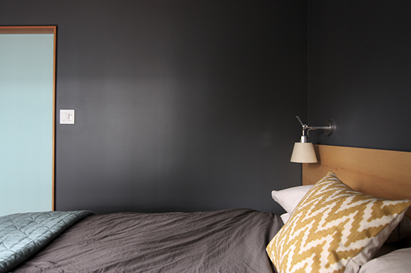
The duvet is from IKEA (already owned) and I picked up the pillow and blanket from West Elm. We’re not big into accessorizing but I think these two additions really help tie everything together. The overall color palette doesn’t stray from the rest of our house, but what can we say – we like it! Besides, when you live in a small and fairly open house there’s a good argument for keeping things simple.
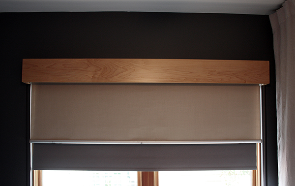
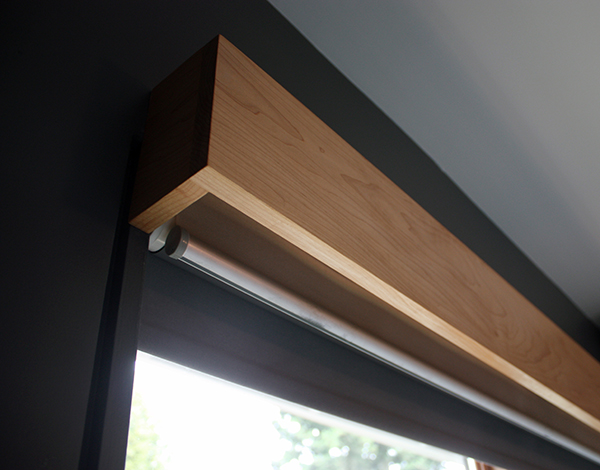
Another project we took on was building a custom valence to go over the window. Last year we swapped out the ugly brown curtain for a blackout roller shade from IKEA. It works great but having the shade face-mounted above the window (we have a translucent roller shade mounted within the window frame) always bothered us. So, Kyle built this valence out of maple trim boards (with a few coats of polyurethane for good measure). We also switched the positions of the roller shades so when the blackout shade was down there would be less light leakage at the sides.
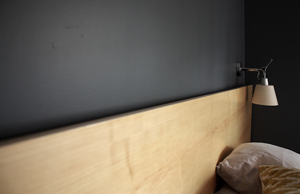
The bedside sconces are from the Artemide Tolomeo line and the same ones we splurged on six years ago. Fortunately, the distance between the wall and shade was enough to accommodate the new headboard and we like how the two overlap each other.
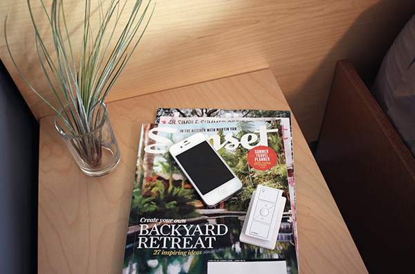
Now, if you have a keen eye you may have noticed in that first photo that the new headboard covers the switches for the sconces. Fortunately, we found a solution in a Pico product line from Lutron. It’s a wireless remote that uses RF technology to operate the light. It has an “on” and “off” option and also a button that goes to a presetting of your choice. While at a lighting conference a while back, one of our friends dubbed this the “sexy time” button. Naturally, it’s the one button Avery always presses first.
Since we have about 5″-6″ of extra space between the wardrobe and the wall on each side, we decided to use the corner piece from the KVARTAL system and extend the track back into the recess. That way, if we wanted we could push the curtains back fully into the recessed niche. When they’re in the extended mode (as pictured above) there’s enough extra curtain that they can partially recess which helps to make the system feel more built in. For the money, I like the system a lot but it’s not perfect. Although we installed everything with as much precision as we could, the curtains don’t glide seamlessly over the seams between tracks.
Here’s a close up look of how the track is installed.
I regret not taking a photo of how the headboard is installed, but this shows how it does in fact stand off the wall by a few inches, creating a nice little shadow line and working with a room where the walls are not perfectly plumb and square. The detail is actually pretty simple – we made a French cleat out of tapered 2x’s with one attached to the back of the headboard and the other attached to the wall. The headboard cleat sits on top of the wall one (basically like this), ensuring a snug fit.
Like the nursery, we opted to leave the ceiling white. In this room, that meant repainting in “Super White” over the really bad yellow “white” paint that we used years ago.
A few more detail shots:
At the base of the IKEA wardrobe, Kyle installed a new piece of maple trim (glued in place to avoid exposed fasteners). This helps hide the edge of the carpet and the wardrobe toekicks that we installed backwards on all three units. (Until now, we had a piece of scrap masonite cut to size and glued to the raw MDF face.)
This room was the only space that had fir floors and during the first go-around we tried to salvage them as best we could. Over time, Bailey did a pretty good job gouging them out again and because they were never really great floors we decided to cover them with Flor carpet tiles (we used tiles from the “Suit Yourself” line in Pumice). We love it! The install was fairly easy – Kyle just removed the base shoe at the other three walls and then re-installed it a bit higher (before we repainted) to allow the tiles to slip underneath. (The shoe was originally installed because after we replaced all the lath and plaster with the thinner drywall, there was a small gap between the base trim and finish floor in some spots.)
Here are a few more detail shots of the valence. Kyle glued and biscuited the joints in his shop and then attached it to the wall using long screws that go through the top of the end pieces at an angle. We left the top open to simplify construction and keep it from becoming a dust shelf.
In the end, we didn’t really pick one of the three schemes that we originally blogged about but I think it’s a hybrid between a few of them. Although I’d been crushing on that West Elm chair, I finally decided it wasn’t all that practical (having one kept me from being able to open my drawers all the way) and that maybe, just maybe, not having one would force me to actually hang up my clothes. So far, so good!
All in all, we’re really happy with the space. It’s cozier and more peaceful than it was before (and way less frightening than when we moved in!). We’re finding that we spend more time as a family in there too – mostly on weekend mornings or in that hour before bedtime when everyone is winding down. Working our way through a stack of children’s books (a few of which have been read so many times that I had to hide them to save my sanity) is a nightly ritual and our bed has become a welcome alternative as both Avery and my belly get bigger and it’s been more of a challenge to fit on the glider in her room.
Most importantly though, the room is golden-approved. A light breeze through the window and Bailey will gladly nap for hours on end in there.



It looks amazing! I love the simple look of the matching plywood on all of the pieces in there. It is clean and streamlined, something I adore in other people’s homes although I can never embrace it in my own!
I love your aesthetic and attention to detail. The new look is very soothing. And if Bailey likes it that says it all!
I love the modern lines, but I also must say, you both make plywood look beautiful. 🙂
I have been wanting to do some type of wooden skirt type thing like yours as my bed currently is on the box springs on the floor (it’s the most comfortable that way!) – I love the way this looks with your headboard!! Very inspiring!
The bedroom looks so peaceful! It looks designed but very real, if that makes sense. I love your blog!
Looks great!
Love all the updates – especially the wall color! You had me giggling at “sexy time.”
Thanks June! That does make sense and is definitely a compliment for us. 🙂
thanks Ron! looking for my next welding project still 🙂
What part of the install required the laser level??
Haha, the thing in the first photo? That’s actually a work light. (We’re not that OCD.) 🙂
well I might be that OCD but yeah we call it the light tube or rocket launcher. The photo shows it in the stowed away postion, there is a tube light that rises up out of the red cylinder with some large CFL bulbs to give 360 degree lighting.
This looks really nice. 🙂 It’s simple, but well thought out. Enjoy your pretty new bedroom!
I love the open concept. It all looks wonderful. Really nice job.
Yep, love it! And the reverse area rug is such a great idea. I can’t seem to pull the trigger on only carpeting our bedrooms – I swore I would only ever have wood or tile floors. Now I understand the pull of carpet but I’d still rather have something refinish-able underneath it and be able to really clean the carpet. This seems like a good compromise. This, or a Dash and Albert indoor/outdoor area rug, but that would allow all of the dog hair tumbleweeds to accumulate in the corners still. Great pattern choice too. We went into the Flor store on 1st Ave and it seemed like most of their squares had mitered edges (or whatever you’d call that) and really called attention to the fact that they were individual squares. This seems not to do that as much?
Hi Paige,
I think most of the patterns they have you will see the edges, that never bothered us though:) They do have some patterns that are meant to hide the edge but you would have limited options and probably would be a shaggier surface which is harder to keep clean.
Looks lovely and peaceful!
I have a question on the kvartel if you dont mind me asking. I need to separate our shore bedroom a bit because my daughter will not sleep if she can see us in bed so we were thinking we would divid the room with these tracks. How exactly did you install them in the ceiling? Did you need to find a stud? Any tips/tricks? Was the curtain also from ikea?
In our bedroom we have shiplap wood siding under the drywall (old house, who knows) so we just used a long wood screw. In Avery’s room though it was was just drywall over framing and I think we just used a regular screw there too. (Of course IKEA makes you provide your own fasteners since they don’t know what kind of wall/ceiling it’s going into.) I think as long as you’re not hanging something really heavy (or hanging on the curtains, haha) it’s probably ok. The KVARTAL system comes with the stand-off pieces that attach to the wall. If you’re using the wall-mounted brackets probably better to place them on a stud location if possible. Yes, the curtain was from IKEA too (which is nice because it already has the attachment backing at the top for the little plastic hooks that fit into the track). My only complaint really is that if if you have seams between multiple tracks it’s hard to get them to align perfectly and thus hard to slide the curtain over the seam.
Thanks!
Love your bed! Is it from IKEA or do you custom make it? Thanks!
Lauren / Kyle-
I was wondering if you could give me a review of the Flor carpet tiles, now that you’ve had them for a little while… specifically, how are they holding up with your dog? I’ve actually been looking at the Suit Yourself series, and google searches lead me to you 🙂
We would be installing them in our family room, so it would be a wall to wall application. Do you think they are soft enough to be in the main play-space of a toddler? I’ve never bought Flor tiles before and am a little worried about jumping right in with such a big space…
Thanks in advance!
Hi Katie, we’ve only had the tiles in our bedroom for a few months but so far, so good. I think they’re soft enough for a toddler and hard to say re: a dog. Bailey definitely goes into this room but doesn’t really run or skid (there just isn’t enough room). The only issues we’ve had so far are the ones in the mudroom. They’ve been there for 4-5 years(?) and are getting a little worn from Bailey (who spends a LOT of time in that space). However, it’s more the “house pet” style (not sure if they still have that one) which is a longer pile and would be more susceptible to that. We actually picked out that one because we thought it would better camouflage dog hair and it is good for that! I would definitely order at least 10% extra tiles so you have some on hand if they need to be replaced. I’ve also found that Flor tends to cycle through styles so they might not have the same tiles if you wait till they need to be replaced to order more. In general though, we’ve been really happy with their products. You can also order sample tiles and they do have some showroom locations with bigger samples to check out (or you could order 4-6 tiles and do your own test before ordering some for the whole space). Good luck!
hi Lauren,
can ikea’s KVARTAL track system support curtain weight if it is to be mounted on plastered ceiling?
I think it would depend on the weight of the curtains and condition of the plaster – we actually have wood boards under our drywall so could anchor into that. I know there are special anchors for plaster so maybe that could work?
I love the valance you built!
Do you mind sharing which stain/ treatment you gave tot he maple and how you attached into the wall?
Thank you very much!