One of the things that our friends ask us the most is, “how do you agree on things?”. Over the last few years, we’ve learned that it’s best to divide up tasks based on personal strengths and interests. But when it comes to the design process, we’re equally involved. Fortunately, we both have a similar design aesthetic and subconsciously, sometimes I wonder if it’s part of what attracted us to each other – dark hair, blue eyes, mad design skills. Anyway, there are those rare times where we completely butt heads on something. The most recent victim – barstools. A few weeks ago I casually e-mailed Kyle some ideas, and he came back with his own, very different list of favorites. Here are just a few examples…
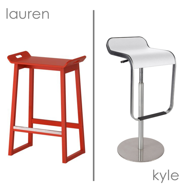
Exhibit #1: I liked the simplicity and price of these IKEA barstools and I don’t know, I just really liked those handles. I wasn’t crazy about the red, but assumed they could easily be painted. Kyle shot back with the sexy LEM Piston Stool. Wood and $ vs. steel and $$$$. Oh dear.
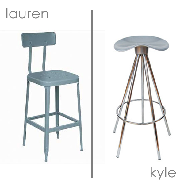
Exhibit #2: I liked the industrial, slightly retro feeling of this stool, while Kyle was drawn to the this. See the similarities? Yeah, exactly.
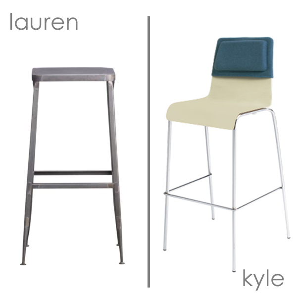
Exhibit #3: Ok, so maybe comfort isn’t a top priority of mine. I kept finding things that were slightly industrial, and I thought this one from CB2 would provide a nice contrast to some of the other things we have going on in the space. Kyle picked out the “stool stool” from BluDot. No back versus back cushion. This wasn’t looking very good. Ultimately, we decided that we wanted something with a little support but that could still tuck under the counter (because you know, that’s easy to find).
At one point, the only thing we could agree on was to do a throw-back to our architecture school days and get these crazy cheap drafting stools. And no, they’re not comfortable at all. In fact, most people only use them for a semester or two before realizing that they’ll be spending the next 4-5 years in studio and to just pony up and get a comfy chair. (Just found this photo, one of my favorites, while trying unsuccessfully to find a picture of Kyle’s “captain’s chair”.)
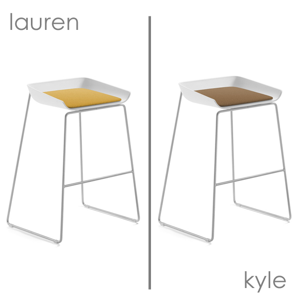
Exhibit #4: And then, when we both thought it may never happen – consensus. Well, almost. We both gave the stamp of approval to the Scoop stool from Steelcase. It’s modern (but not too modern), it has a bit of back (but still slides underneath the counter), and the colors work with our palette (it comes with an optional cushion). And in full disclosure, we were also thrilled to learn that Steelcase has a great architect pricing program which definitely helped seal the deal. Still on my mustard yellow kick, I liked the idea of finally getting some more color in the space. Kyle commented that it looked like a fried egg (ugh, so true!!) and wanted something closer to this camel color.
A few days later, Kyle stopped by Steelcase’s showroom, only to learn that the fabric options and colors are nearly endless. Now we’re thinking of doing leather(since the pads are unfortunately, not machine washable). So now we’re torn between a light blue and a dark brown (I know, we’re really going outside our comfort zone here).
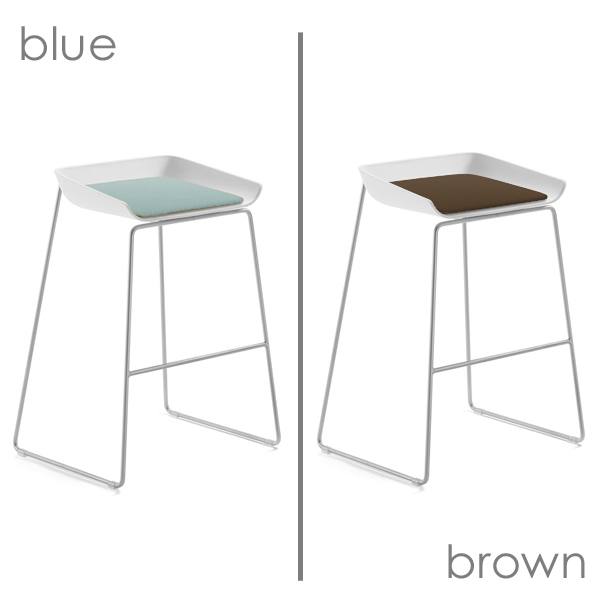
In the end, crisis averted. So what do you think? Is it a good fit for chezerbey? Should we do the blue or the brown? We’re both leaning towards one color, but are curious to hear what others think.

I didnt know they had this kind of bar stool! I would grab Kyle from exhibit #1 in ajiffy…It’s so cool and very chic! this is such a wonderful post. I have choices now, instead of the wooden barstool that my wife suggests All Tex Exteriors
I like the stool. I think the brown won’t look at dirty over time.
Blue 🙂
We had this same dilemma and I wish we would have found these Steelcase stools. (I’m intrigued by the architect discount too.) We ended up getting the Ikea Sebastian.
I like the blue or yellow.
I love colour, so I’d get either the blue or the yellow. The blue is more understated and will probably blend with more colour schemes over time, and goes with the yellow if you use that yellow elsewhere.
I’m voting blue. I like that you went through your decision process it really is interesting to see how you ended up picking what you did.
I think your third choice, the backless industrial, is the best. Too bad! That would be my #1…
But otherwise go with the blue cushion.
Nice choice! If it were fabric, I’d vote brown, but if it’s leather..I vote go for blue…it can take it! Stock up on some saddle soap and worry no more!
How many are you getting? If just two, I’d say blue. If you get three, I’d say two blue and one brown. Might as well get what you both want. : ) I like them. Also, this post made me laugh.
If you are getting 3 stools why not go with 1 yellow, 1 blue, and 1 brown?
Go blue! It will look pretty with the floors.
I still have Kyle’s first studio chair that he gave me when he got the captains chair….I can ship it……
Ha, that’s awesome. I forgot that he had one in between. I think he sold his captain’s chair to a promising 1st year student.
[…] dining chair dilemma October 28, 2010 by chezerbey Apparently, the barstool dilemma was just a prelude to the dining chair dilemma. We thought we had this one figured out long ago, […]